It’s official, our master bathroom renovation is finally complete! I can’t believe we waited over 7 years to start our bathroom renovation. To be quite honest, I could have completed a long time ago, however I had other priorities in life, like traveling, and kept pushing it off. Once we found out we had a baby on the way, I decided it was now or never! I am so happy that we did it and very happy with how everything turned out. Hope you’re ready to check it out! I’ll be sharing before and after photos as well as including links to all products for you.
Let’s start by throwing it back to what our master bathroom looked like before — it was a typical builder grade bathroom, with dark wood cabinets, outdated and just plain ugly in my opinion. On a positive note, it is spacious and required minimal renovating as it is a newer home.


We did not want to get involved in a huge project with changing the layout and moving plumbing, so we kept everything more or less in the same area. We decided to get rid of the tub as we never used it before and have a tub in our guest bathroom. Instead, we made the shower larger and created an empty space where we could add furniture for storage. I will say it was a hard decision, as I have always wanted a freestanding tub, but I had to be realistic and admit I would not really use it.
The Shower


As I stated before, the bathroom was very dark so it was important to me that with this renovation the bathroom turned out light and bright. The fact that the bathroom has only one small window in the separate toilet area doesn’t help either, but I think the tiles we chose did brighten up the entire bathroom significantly.
I had a hard time deciding between gold or silver finishes, however so happy I ultimately went with gold. I just love the look so much! As far as the tiles, I used small marble hexagon for the shower floor, but a ceramic tile on the walls that have a marble look. Not only did this help with keeping the bathroom more affordable, but also much easier for maintenance purposes. This specific tile has antimicrobial features, which help to fight stains, scratches and odor causing bacteria.
I had 2 shower niches created, one for shampoos, body wash, etc and another smaller niche centered under our larger niche that’s a foot rest for shaving. It’s the perfect spot for your razor as well.
Shower Details
Shower System | Shower Drain | Shower Wall Tiles | Shower Floor Tiles
The Vanity


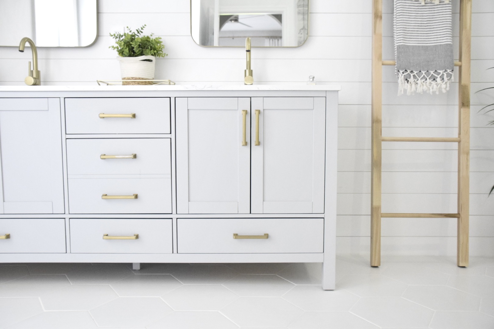
Our previous vanity was about 80 inches, however we decided to do a 72 inch vanity because we wanted to center the vanity to the bathroom and not have it attached to the wall. Since we already had white floor tiles, I thought a dove gray vanity would be the perfect contrast. The vanity came with the hardware, sinks and a composite Carrara white stone countertop, I simply added two bathroom faucets. I specifically chose a vanity that did not have a marble countertop as I did not want to be stressed out about it getting stained easily. From my understanding, marble is very difficult to keep up with and I was just not interested in that type of maintenance, although I do love the look of marble.
Above each sink I used 24″ x 36″ gold metal framed rectangle mirrors. For lighting, I chose two glass globe shades placed above each of the mirrors.


The floor tiles I chose, throughout the bathroom are a white hexagon. I really wanted to do a light wood-like herringbone style, however I couldn’t find any options I loved. Of course, I found some tiles I loved that were marble, however they were way over our budget.
As far as an accent wall behind the vanity, I decided to go with some simple white shiplap. Although some tile, would have been more of a statement, I ultimately chose the shiplap as it was the most cost effective option as compared to leaving the wall just painted. Our was measures 10ft x 10ft, so covering it in tile would have been very costly. I love how the shiplap turned out and really added a timeless, yet elegant look.
Vanity Details
Vanity | Mirrors | Lighting | Faucets | ShipLap | Hexagon Floor Tiles
Corner Nook


As you can see, this area is where the old tub use to be. I personally prefer it without the tub, however a freestanding tub, would have been beautiful as well. For now, I placed a ladder to hang towels, a small storage piece and a plant to add a touch of foliage. I plan to either modified this area or possibly add some photos above the storage piece. I haven’t completely decided yet.
I will say, it seems someone loves the new bathroom!
Corner Nook Details
Storage Piece | Towel Ladder | Foliage plant (old from TJMaxx)
Toilet Room


Having a separate toilet room with a door is always a plus for some added privacy. I decided to extend the shiplap along the posterior wall of the toilet for some texture. This area still needs some love and I haven’t decided exactly what I will use to decorate the wall above the toilet, but I will keep you posted as I continue updating this space.
Toilet Room Details
Toilet | Toilet Paper Holder | Woven Trash Basket
There you have it! Our recent master bathroom renovation! I’m not completely finished with decorating the entire bathroom, however as I add decor items and finishing touches, I will update photos for you. I hope that my bathroom has inspired you and given you ideas on how to remodel your very own bathroom. Let me know what you think of the remodel and feel free to ask any questions below! Look forward to hearing from you!
SHOP THE POST
If you enjoyed this post, please share on social media and/or comment below!


Christine! It looks beautiful! Very inspiring! I love the ladder idea, too!
Hi! Great blog, I originally started looking at your NYC post but somehow ended over here! LOL. You show great taste and style. Keep it up!
OMG! Thank you so much Brigid!